实际开发中,我们可能需要自己写一些自定义的分页设计,所以我们需要学会自己封装一个可以直接套用的分页控件,以下就是一个完整的用例,话不多说,我们直接上代码实现。
1.新建一个分页控件View:PaginationControl
1.1 UI展示如下
<UserControl x:Class="WPFDemoMVVM.Controls.PaginationControl"
			 xmlns="http://schemas.microsoft.com/winfx/2006/xaml/presentation"
			 xmlns:x="http://schemas.microsoft.com/winfx/2006/xaml"
			 xmlns:mc="http://schemas.openxmlformats.org/markup-compatibility/2006"
			 xmlns:d="http://schemas.microsoft.com/expression/blend/2008"
			 xmlns:local="clr-namespace:WPFDemoMVVM.Controls"
			 xmlns:cov="clr-namespace:WPFDemoMVVM.Converters"
			 xmlns:lang="clr-namespace:WPFDemoMVVM.Resources"
			 xmlns:lex="http://wpflocalizeextension.codeplex.com"
			 lex:ResxLocalizationProvider.DefaultAssembly="WPFDemoMVVM"
			 lex:ResxLocalizationProvider.DefaultDictionary="Lang"
			 lex:LocalizeDictionary.DesignCulture="zh-CN"
			 mc:Ignorable="d"
			 d:DesignHeight="30" d:DesignWidth="600" Height="30" Width="780" x:Name="Pagination" >
	<UserControl.Resources>
		<Style x:Key="PgBaseButtonStyle" TargetType="Button" >
			<Setter Property="Template">
				<Setter.Value>
					<ControlTemplate TargetType="Button">
						<Border CornerRadius="6"
							 Background="{TemplateBinding Background}"
							 BorderBrush="{TemplateBinding BorderBrush}"
							 BorderThickness="{TemplateBinding BorderThickness}">
							<Grid>
								<ContentPresenter HorizontalAlignment="Center"
							   VerticalAlignment="Center"
							   Content="{TemplateBinding Content}"/>
							</Grid>
						</Border>
					</ControlTemplate>
				</Setter.Value>
			</Setter>
			<Setter Property="Background" Value="#282B3B"/>
			<Setter Property="BorderBrush" Value="#367AFF"/>
			<Setter Property="BorderThickness" Value="1"/>
			<Setter Property="Foreground" Value="White"/>
			<Setter Property="Padding" Value="0"/>
			<Setter Property="Height" Value="30"/>
			<Setter Property="Width" Value="70"/>
			<Setter Property="FontSize" Value="14"/>
			<Setter Property="VerticalAlignment" Value="Center"/>
			<Setter Property="VerticalContentAlignment" Value="Center"/>
			<Setter Property="HorizontalAlignment" Value="Center"/>
			<Setter Property="HorizontalContentAlignment" Value="Center"/>
			<Setter Property="Margin" Value="5 0"/>
			<Style.Triggers>
				<Trigger Property="IsMouseOver" Value="True">
					<Setter Property="Foreground" Value="White"/>
					<Setter Property="BorderThickness" Value="2"/>
					<Setter Property="Cursor" Value="Hand"/>
					<Setter Property="Opacity" Value="1"/>
				</Trigger>
			</Style.Triggers>
		</Style>

		<Style x:Key="PgComBoxStyle" TargetType="ComboBox">
			<Setter Property="Background" Value="#0D0D19"/>
			<Setter Property="FontSize" Value="14"/>
			<Setter Property="Margin" Value="20,0,0,0"/>
			<Setter Property="Height" Value="32"/>
			<Setter Property="Width" Value="80"/>
			<Setter Property="VerticalAlignment" Value="Center"/>
			<Setter Property="HorizontalAlignment" Value="Center"/>
			<Setter Property="BorderBrush" Value="#367AFF"/>
			<Setter Property="BorderThickness" Value="0"/>
			<Setter Property="FontFamily" Value="Arial"/>
		</Style>


		<Style TargetType="TextBlock" x:Key="BaseTextBlockStyle">
			<Setter Property="FontSize" Value="14"/>
			<Setter Property="FontFamily" Value="Arial"/>
			<Setter Property="FontWeight" Value="Normal"/>
			<Setter Property="Opacity" Value="1"/>
			<Setter Property="Background" Value="{x:Null}"/>
			<Setter Property="Foreground" Value="White"/>
			<Setter Property="VerticalAlignment" Value="Center"/>
			<Setter Property="HorizontalAlignment" Value="Center"/>
			<Setter Property="Padding" Value="0"/>
		</Style>

		<Style x:Key="BaseComboBoxStyle" TargetType="ComboBox">
			<Setter Property="Foreground" Value="White"/>
			<Setter Property="Background" Value="#0D0D19"/>
			<Setter Property="BorderThickness" Value="0"/>
			<Setter Property="FontSize" Value="14"/>
			<Setter Property="FontFamily" Value="Arial"/>
			<Setter Property="Width" Value="80"/>
			<Setter Property="Height" Value="32"/>
			<Setter Property="FontSize" Value="14"/>
			<Setter Property="HorizontalAlignment" Value="Right"/>
			<Setter Property="VerticalAlignment" Value="Center"/>
			<Setter Property="Margin" Value="5,0,5,0"/>
			<Setter Property="IsEditable" Value="False"/>
			<Setter Property="ItemTemplate">
				<Setter.Value>
					<DataTemplate>
						<TextBlock Text="{Binding}" Style="{StaticResource BaseTextBlockStyle}" HorizontalAlignment="Center"/>
					</DataTemplate>
				</Setter.Value>
			</Setter>
			<Setter Property="Template">
				<Setter.Value>
					<ControlTemplate TargetType="ComboBox">
						<Grid>
							<ToggleButton
									Name="ToggleButton"
									IsChecked="{Binding Path=IsDropDownOpen, Mode=TwoWay, RelativeSource={RelativeSource TemplatedParent}}"
									ClickMode="Press"
									Background="{TemplateBinding Background}"
									BorderThickness="{TemplateBinding BorderThickness}" Width="{TemplateBinding Width}">
								<Grid>
									<ContentPresenter
										Name="ContentSite"
										IsHitTestVisible="False"
										Content="{TemplateBinding SelectionBoxItem}"
										ContentTemplate="{TemplateBinding SelectionBoxItemTemplate}"
										VerticalAlignment="Center"
										HorizontalAlignment="Left" Width="60"
										Margin="5,0,0,0"
										RecognizesAccessKey="True"/>
									<Path
										HorizontalAlignment="Right"
										Margin="0,0,6,0"
										VerticalAlignment="Center"
										Data="M 0 0 L 4 4 L 8 0 Z"
										Fill="White"/>
								</Grid>
							</ToggleButton>
							<Popup
								Name="Popup"
								Placement="Bottom"
								IsOpen="{TemplateBinding IsDropDownOpen}"
								AllowsTransparency="True"
								Focusable="False"
								PopupAnimation="Slide">
								<Grid
									Name="DropDown"
									SnapsToDevicePixels="True"
									MinWidth="{TemplateBinding ActualWidth}"
									MaxHeight="200"
									Background="#0D0D19">
									<Border x:Name="DropDownBorder" BorderThickness="0" Background="#0D0D19"/>
									<ScrollViewer Margin="4,6,4,6" SnapsToDevicePixels="True">
										<StackPanel IsItemsHost="True" KeyboardNavigation.DirectionalNavigation="Contained" />
									</ScrollViewer>
								</Grid>
							</Popup>
						</Grid>
						<ControlTemplate.Triggers>
							<Trigger Property="HasItems" Value="false">
								<Setter TargetName="DropDownBorder" Property="MinHeight" Value="95"/>
							</Trigger>
							<Trigger Property="IsEnabled" Value="false">
								<Setter Property="Foreground" Value="Gray"/>
							</Trigger>
							<Trigger Property="IsMouseOver" Value="True">
								<Setter Property="Background" Value="#1A1A2A"/>
							</Trigger>
						</ControlTemplate.Triggers>
					</ControlTemplate>
				</Setter.Value>
			</Setter>
		</Style>

		<Style TargetType="TextBox" x:Key="BaseTextBoxStyle">
			<Setter Property="Height" Value="32"/>
			<Setter Property="Width" Value="98"/>
			<Setter Property="FontSize" Value="14"/>
			<Setter Property="FontFamily" Value="Arial"/>
			<Setter Property="FontWeight" Value="Normal"/>
			<Setter Property="Opacity" Value="0.8"/>
			<Setter Property="Background" Value="#0C0E1A"/>
			<Setter Property="Foreground" Value="White"/>
			<Setter Property="BorderThickness" Value="0"/>
			<Setter Property="Padding" Value="0"/>
			<Setter Property="VerticalAlignment" Value="Center"/>
			<Setter Property="HorizontalAlignment" Value="Center"/>
			<Setter Property="VerticalContentAlignment" Value="Center"/>
			<Setter Property="HorizontalContentAlignment" Value="Left"/>
			<!-- 设置光标颜色为白色 -->
			<Setter Property="CaretBrush" Value="White"/>

			<!--<Style.Triggers>
			 <Trigger Property="IsMouseOver" Value="True">
				 <Setter Property="Foreground" Value="White"/>
				 <Setter Property="Cursor" Value="Hand"/>
			 </Trigger>
		 </Style.Triggers>-->
		</Style>


		<cov:FormatStringMultiConverter x:Key="FormatStringMultiConverter"/>
	</UserControl.Resources>


	<StackPanel Orientation="Horizontal" HorizontalAlignment="Center">
		<Button Content="{lex:Loc HomePage}" Command="{Binding FirstPageCommand}"  Style="{DynamicResource ResourceKey=PgBaseButtonStyle}"/>
		<Button Content="{lex:Loc PrevPage}" Command="{Binding PrevPageCommand}" Style="{DynamicResource ResourceKey=PgBaseButtonStyle}" />
		<TextBlock Margin="10,0" Text="{Binding PageStatus}" Style="{DynamicResource ResourceKey=BaseTextBlockStyle}" Width="auto" FontSize="14"/>
		<Button Content="{lex:Loc NextPage}" Command="{Binding NextPageCommand}" Style="{DynamicResource ResourceKey=PgBaseButtonStyle}"/>
		<Button Content="{lex:Loc LastPage}" Command="{Binding LastPageCommand}" Style="{DynamicResource ResourceKey=PgBaseButtonStyle}"/>
		<TextBlock Text="{lex:Loc PageSize}" VerticalAlignment="Center" Style="{DynamicResource ResourceKey=BaseTextBlockStyle}" FontSize="14"/>
		<ComboBox ItemsSource="{Binding PageSizeOptions, Mode=OneWay}" SelectedItem="{Binding PageSize,  Mode=TwoWay}" Style="{DynamicResource BaseComboBoxStyle}"/>
		<TextBlock Text="{lex:Loc Total}" VerticalAlignment="Center" Style="{DynamicResource ResourceKey=BaseTextBlockStyle}" Margin="5" FontSize="14"/>
		<TextBox Text="{Binding TotalItems}" Style="{DynamicResource ResourceKey=BaseTextBoxStyle}" IsEnabled="False"></TextBox>
	</StackPanel>
</UserControl>
1.2 分页控件的ViewModel:
public partial class PagingViewModel : ObservableObject
{
	public PagingViewModel()
	{
		PageSizeOptions = new ObservableCollection<int> { 10, 20, 50 };
		PageSize = 10;
		CurrentPage = 1;
		Language = "zh-CN";
	}

	[ObservableProperty]
	private int currentPage;

	[ObservableProperty]
	private int pageSize;

	[ObservableProperty]
	private int totalItems;

	[ObservableProperty]
	private string language;

	[ObservableProperty]
	private ObservableCollection<int> pageSizeOptions;

	public int TotalPages => PageSize == 0 ? 1 : (int)Math.Ceiling((double)TotalItems / PageSize);
	public string PageStatus => Language == "zh-CN" ? $"第 {CurrentPage} / {TotalPages} 页" : $"page {CurrentPage} of {TotalPages}";

	// 每当这些属性改变时,通知依赖属性的更新
	partial void OnCurrentPageChanged(int value)
	{
		OnPropertyChanged(nameof(PageStatus));
	}

	partial void OnPageSizeChanged(int value)
	{
		CurrentPage = 1;
		OnPropertyChanged(nameof(TotalPages));
		OnPropertyChanged(nameof(PageStatus));
		GoToPage(CurrentPage);
	}

	partial void OnTotalItemsChanged(int value)
	{
		OnPropertyChanged(nameof(TotalPages));
		OnPropertyChanged(nameof(PageStatus));
	}

	partial void OnLanguageChanged(string value)
	{
		OnPropertyChanged(nameof(PageStatus));
	}

	[RelayCommand]
	private void FirstPage() => GoToPage(1);

	[RelayCommand]
	private void PrevPage() => GoToPage(Math.Max(1, CurrentPage - 1));

	[RelayCommand]
	private void NextPage() => GoToPage(Math.Min(TotalPages, CurrentPage + 1));

	[RelayCommand]
	private void LastPage() => GoToPage(TotalPages);

	private void GoToPage(int page)
	{
		CurrentPage = page;
		PageChanged?.Invoke(CurrentPage, PageSize);
	}

	public event Action<int, int> PageChanged;
}
2.DataGrid 界面展示如下:
2.1 UI展示效果如下:
<Window x:Class="WPFDemoMVVM.View.DataGridView"
		xmlns="http://schemas.microsoft.com/winfx/2006/xaml/presentation"
		xmlns:x="http://schemas.microsoft.com/winfx/2006/xaml"
		xmlns:d="http://schemas.microsoft.com/expression/blend/2008"
		xmlns:mc="http://schemas.openxmlformats.org/markup-compatibility/2006"
		xmlns:local="clr-namespace:WPFDemoMVVM.View"
		xmlns:hr="clr-namespace:WPFDemoMVVM.Helpers"
		xmlns:be="clr-namespace:WPFDemoMVVM.Behaviors"
		xmlns:i="http://schemas.microsoft.com/xaml/behaviors"
		xmlns:pg="clr-namespace:WPFDemoMVVM.Controls"
		xmlns:lang="clr-namespace:WPFDemoMVVM.Resources"
		xmlns:lex="http://wpflocalizeextension.codeplex.com"
		lex:ResxLocalizationProvider.DefaultAssembly="WPFDemoMVVM"
		lex:ResxLocalizationProvider.DefaultDictionary="Lang"
		lex:LocalizeDictionary.DesignCulture="zh-CN"
		mc:Ignorable="d"
		Title="DataGridView" Height="600" Width="800">
	<Window.Resources>
		<CollectionViewSource x:Key="view" Filter="CollectionViewSource_Filter"/>


		<!--datagrid样式-->
		<Style x:Key="DataGridStyleCommon" TargetType="DataGrid">
			<Setter Property="RowHeight" Value="40"/>
			<Setter Property="Background"  Value="#191D2A" />
			<Setter Property="BorderBrush"  Value="{x:Null}" />
			<Setter Property="Foreground" Value="White"/>
			<Setter Property="Opacity" Value="1"/>
			<!--该属性指示是否允许用户调整列宽度-->
			<Setter Property="CanUserResizeColumns"   Value="false" />
			<!--网格线颜色-->
			<Setter Property="VerticalGridLinesBrush" Value="{x:Null}"/>
			<Setter Property="IsReadOnly" Value="True"></Setter>
			<Setter Property="HorizontalGridLinesBrush">
				<Setter.Value>
					<SolidColorBrush Color="#10FFFFFF" />
					<!--网格透明度-->
				</Setter.Value>
			</Setter>
			<!--<Setter Property="VerticalGridLinesBrush">
		 <Setter.Value>
			 <SolidColorBrush Color="#FFEA8777" />
		 </Setter.Value>
	 </Setter>-->
			<!--表格字段显示手动完成-->
			<Setter Property="AutoGenerateColumns" Value="False"></Setter>
			<!--隔行换色 -->
			<Setter Property="AlternationCount" Value="3"></Setter>
			<!--DataGrid控件模板-->
			<Setter Property="Template">
				<Setter.Value>
					<ControlTemplate TargetType="{x:Type DataGrid}">
						<Border BorderBrush="{TemplateBinding BorderBrush}" BorderThickness="{TemplateBinding BorderThickness}" x:Name="border"
						 Background="{TemplateBinding Background}" Padding="{TemplateBinding Padding}" SnapsToDevicePixels="True">
							<ScrollViewer x:Name="DG_ScrollViewer" Focusable="false">
								<ScrollViewer.Template>
									<ControlTemplate TargetType="{x:Type ScrollViewer}">
										<Grid>
											<Grid.ColumnDefinitions>
												<ColumnDefinition x:Name="col_rowheader" Width="1" />
												<ColumnDefinition Width="*" />
												<ColumnDefinition Width="Auto" />
											</Grid.ColumnDefinitions>
											<Grid.RowDefinitions>
												<RowDefinition Height="Auto" />
												<RowDefinition Height="*" />
												<RowDefinition Height="Auto" />
											</Grid.RowDefinitions>
											<!--选中所有行-->
											<Button Command="ApplicationCommands.SelectAll" Focusable="False" Style="{DynamicResource {ComponentResourceKey ResourceId=DataGridSelectAllButtonStyle, TypeInTargetAssembly={x:Type DataGrid}}}" Width="{Binding CellsPanelHorizontalOffset, RelativeSource={RelativeSource FindAncestor, AncestorLevel=1, AncestorType={x:Type DataGrid}}}">
												<Button.Visibility>
													<Binding Path="HeadersVisibility" RelativeSource="{RelativeSource FindAncestor, AncestorLevel=1, AncestorType={x:Type DataGrid}}">
														<Binding.ConverterParameter>
															<DataGridHeadersVisibility>All</DataGridHeadersVisibility>
														</Binding.ConverterParameter>
													</Binding>
												</Button.Visibility>
											</Button>
											<!--表格头部-->
											<DataGridColumnHeadersPresenter x:Name="PART_ColumnHeadersPresenter" Grid.Column="1" Grid.ColumnSpan="2"
												 Visibility="{Binding HeadersVisibility, ConverterParameter={x:Static DataGridHeadersVisibility.Column}, Converter={x:Static DataGrid.HeadersVisibilityConverter}, RelativeSource={RelativeSource AncestorType={x:Type DataGrid}}}" >
											</DataGridColumnHeadersPresenter>
											<!--主数据区-->
											<Grid Grid.Row="1" Grid.ColumnSpan="2">
												<ScrollContentPresenter x:Name="PART_ScrollContentPresenter" CanContentScroll="{TemplateBinding CanContentScroll}" Grid.ColumnSpan="2" />
											</Grid>
											<!--垂直滑动条-->

											<ScrollBar x:Name="PART_VerticalScrollBar" Grid.Column="2" Maximum="{TemplateBinding ScrollableHeight}"
												Orientation="Vertical" Grid.Row="0" Grid.RowSpan="3" Visibility="{TemplateBinding ComputedVerticalScrollBarVisibility}"
												Value="{Binding VerticalOffset, Mode=OneWay, RelativeSource={RelativeSource TemplatedParent}}"
												ViewportSize="{TemplateBinding ViewportHeight}" />

											<!--横向滑动条-->
											<!--
									 <ScrollBar x:Name="PART_HorizontalScrollBar" Grid.Column="0" Grid.ColumnSpan="2" Grid.Row="2"
													Maximum="{TemplateBinding ScrollableWidth}" Orientation="Horizontal"
													Visibility="{TemplateBinding ComputedHorizontalScrollBarVisibility}"
													Value="{Binding HorizontalOffset, Mode=OneWay, RelativeSource={RelativeSource TemplatedParent}}"
													ViewportSize="{TemplateBinding ViewportWidth}" />-->
										</Grid>
									</ControlTemplate>
								</ScrollViewer.Template>
								<ItemsPresenter SnapsToDevicePixels="{TemplateBinding SnapsToDevicePixels}" />
							</ScrollViewer>
						</Border>
						<ControlTemplate.Triggers>
							<Trigger Property="IsEnabled" Value="false">
								<Setter Property="Opacity" Value="1" TargetName="border" />
							</Trigger>
						</ControlTemplate.Triggers>
					</ControlTemplate>
				</Setter.Value>
			</Setter>
			<Style.Triggers>
				<Trigger Property="IsGrouping" Value="true">
					<Setter Property="ScrollViewer.CanContentScroll" Value="false" />
				</Trigger>
			</Style.Triggers>

		</Style>

		<!--行头部样式-->
		<Style x:Key="DataGridRowHeaderStyleCommon" TargetType="DataGridRowHeader">
			<Setter Property="HorizontalContentAlignment" Value="Stretch" />
			<Setter Property="VerticalContentAlignment" Value="Center" />
			<Setter Property="Background" Value="Transparent" />
			<Setter Property="BorderBrush" Value="{x:Null}" />
			<Setter Property="BorderThickness" Value="1" />
			<Setter Property="Margin" Value="0,0,0,0" />
			<Setter Property="Template">
				<Setter.Value>
					<ControlTemplate TargetType="{x:Type DataGridRowHeader}">
						<Grid>
							<Border BorderBrush="{TemplateBinding BorderBrush}"
							Background="{TemplateBinding Background}"
							BorderThickness="{TemplateBinding BorderThickness}"
							Padding="{TemplateBinding Padding}"
							Margin="{TemplateBinding Margin}"
							SnapsToDevicePixels="True">
								<ContentPresenter SnapsToDevicePixels="{TemplateBinding SnapsToDevicePixels}"
										  VerticalAlignment="{TemplateBinding VerticalContentAlignment}"
										  HorizontalAlignment="{TemplateBinding HorizontalContentAlignment}"/>
							</Border>
						</Grid>
					</ControlTemplate>
				</Setter.Value>
			</Setter>
		</Style>

		<!--标题栏 列头部样式-->
		<Style x:Key="DataGridColumnHeaderStyleCommon" TargetType="DataGridColumnHeader">
			<Setter Property="SnapsToDevicePixels" Value="True" />
			<Setter Property="MinWidth" Value="15" />
			<Setter Property="MinHeight" Value="28" />
			<!--<Setter Property="Foreground" Value="#FF0FA459" />-->
			<Setter Property="Foreground" Value="{DynamicResource textBoxWhiteColor}" />
			<Setter Property="FontSize"   Value="14" />
			<!--<Setter Property="Cursor"     Value="Hand" />-->
			<Setter Property="Height" Value="30" />
			<Setter Property="Template">
				<Setter.Value>
					<ControlTemplate TargetType="DataGridColumnHeader">
						<!--设置表头的背景等样式-->
						<Border x:Name="BackgroundBorder"  Background="{DynamicResource backgroundGrayColor}"   BorderThickness="0"   BorderBrush="{DynamicResource borderBrushCommonColor}"  Width="Auto">
							<Grid>
								<Grid.ColumnDefinitions>
									<ColumnDefinition Width="*" />
								</Grid.ColumnDefinitions>
								<!--内容-->
								<ContentPresenter  Margin="0,0,0,0"  VerticalAlignment="Center"  HorizontalAlignment="Center" />
								<!--排序图标-->
								<Path x:Name="SortArrow"  Visibility="Collapsed"   Data="M0,0 L1,0 0.5,1 z"  Stretch="Fill"    Grid.Column="2"
								   Width="8"  Height="6"  Fill="{DynamicResource textBoxWhiteColor}" Margin="0,0,50,0"  VerticalAlignment="Center"  RenderTransformOrigin="1,1" />
								<!--分割线-->
								<Rectangle Visibility="Collapsed"  Width="1" Fill="#d6c79b" HorizontalAlignment="Right"  Grid.ColumnSpan="1"   />
							</Grid>
						</Border>
					</ControlTemplate>
				</Setter.Value>
			</Setter>
		</Style>


		<!--行样式触发-->
		<!--背景色改变必须先设置cellStyle 因为cellStyle会覆盖rowStyle样式-->
		<Style x:Key="DataGridRowStyleCommon"  TargetType="DataGridRow">
			<Setter Property="Background"  Value="#0D0D19"/>
			<Setter Property="Height"  Value="40" />
			<Setter Property="Foreground" Value="White" />
			<Style.Triggers>
				<!--隔行换色-->
				<!--<Trigger Property="AlternationIndex"  Value="0">
			<Setter Property="Background"   Value="{x:Null}" />
		</Trigger>-->
				<!--<Trigger Property="AlternationIndex"   Value="1">
			<Setter Property="Background" Value="#FFD4C9F9" />
		</Trigger>
		<Trigger Property="AlternationIndex"   Value="2">
			<Setter Property="Background" Value="#FFFFCFC7" />
		</Trigger>-->
				<Trigger Property="IsMouseOver"   Value="True">
					<Setter Property="Foreground" Value="White"/>
					<Setter Property="Background"  Value="#191D2A" />
					<Setter Property="Cursor" Value="Hand"/>
					<Setter Property="Opacity" Value="0.6"></Setter>
				</Trigger>
				<Trigger Property="IsSelected" Value="True">
					<!--<Setter Property="Foreground"   Value="#FFF31006" />-->
					<Setter Property="Opacity" Value="1"></Setter>
					<Setter Property="Background" Value="#1D1D2A"/>
				</Trigger>
			</Style.Triggers>
		</Style>

		<!--单元格样式触发-->
		<Style x:Key="DataGridCellStyleCommon" TargetType="DataGridCell">
			<Setter Property="Template">
				<Setter.Value>
					<ControlTemplate TargetType="DataGridCell">
						<TextBlock TextAlignment="Center"  VerticalAlignment="Center">
					<ContentPresenter />
						</TextBlock>
					</ControlTemplate>
				</Setter.Value>
			</Setter>
			<Style.Triggers>
				<Trigger Property="IsSelected" Value="True">
					<Setter Property="Foreground" Value="White" />
					<Setter Property="FontWeight" Value="Bold"/>
				</Trigger>
				<Trigger Property="IsMouseOver" Value="True">
					<Setter Property="Foreground" Value="White"/>
				</Trigger>
			</Style.Triggers>
		</Style>

	</Window.Resources>
	<Grid>
		<Grid.RowDefinitions>
			<RowDefinition/>
			<RowDefinition Height="40"/>
			<RowDefinition Height="80"/>
		</Grid.RowDefinitions>
		<Grid Grid.Row="0" Height="500" Width="auto">
			<DataGrid Name="userInfoGrid"  AutoGenerateColumns="False" Height="440" HorizontalAlignment="Left" HorizontalContentAlignment="Center" VerticalAlignment="Top" IsReadOnly="True" CanUserAddRows="False" VerticalScrollBarVisibility="Auto" EnableRowVirtualization="False"
				Style="{DynamicResource ResourceKey=DataGridStyleCommon}"
				   RowHeaderStyle="{DynamicResource ResourceKey=DataGridRowHeaderStyleCommon}"
				   ColumnHeaderStyle="{DynamicResource ResourceKey=DataGridColumnHeaderStyleCommon}"
				   RowStyle="{DynamicResource ResourceKey=DataGridRowStyleCommon}"
				   CellStyle="{DynamicResource ResourceKey=DataGridCellStyleCommon}" Margin="2 0 5 0" BorderThickness="1" ItemsSource="{Binding CollectionView,Mode=OneWay}"
						  hr:MultiSelectorHelper.MonitorSelectionChanged="True"
hr:MultiSelectorHelper.BindableSelectedItems="{Binding SelectedItems,Mode=OneWayToSource}"
						  >

				<i:Interaction.Behaviors>
					<be:SelectedItemsBehavior BindableSelectedItems="{Binding SelectedItems,Mode=OneWayToSource}"/>
				</i:Interaction.Behaviors>
				<DataGrid.Columns>
					<DataGridTextColumn Binding="{Binding Index}" CanUserSort="False" IsReadOnly="True" Width="50">
						<DataGridTextColumn.HeaderTemplate>
							<DataTemplate>
								<TextBlock Text="{lex:Loc Number}"/>
							</DataTemplate>
						</DataGridTextColumn.HeaderTemplate>
					</DataGridTextColumn>
					<DataGridTextColumn Binding="{Binding Name}" CanUserSort="False" IsReadOnly="True" Width="*">
						<DataGridTextColumn.HeaderTemplate>
							<DataTemplate>
								<TextBlock Text="{lex:Loc AccountName}"/>
							</DataTemplate>
						</DataGridTextColumn.HeaderTemplate>
					</DataGridTextColumn>
					<DataGridTextColumn Binding="{Binding Salary}" CanUserSort="False" IsReadOnly="True" Width="*">
						<DataGridTextColumn.HeaderTemplate>
							<DataTemplate>
								<TextBlock Text="{lex:Loc Salary}"/>
							</DataTemplate>
						</DataGridTextColumn.HeaderTemplate>
					</DataGridTextColumn>
				</DataGrid.Columns>
			</DataGrid>
		</Grid>

		<pg:PaginationControl x:Name="pageControl" Grid.Row="1" DataContext="{Binding Pagination}" VerticalAlignment="Bottom" Background="#191D2A" Height="40">
		</pg:PaginationControl>
		<StackPanel Grid.Row="2" Orientation="Horizontal">

			<!--<TextBox x:Name="queryKeyword"  Width="200" Height="50" TextChanged="queryKeyword_TextChanged"/>-->
			<TextBlock Text="{lex:Loc AccountName}" Style="{DynamicResource TextBlockBaseStyle}" Margin="5"/>
			<TextBox x:Name="queryKeyword" Text="{Binding QueryKeyword,UpdateSourceTrigger=PropertyChanged}" Width="200" Height="32" Margin="5"/>
			<Button Margin="5" Content="{lex:Loc Add}" Command="{Binding AddCommand}"/>
			<Button Margin="5" Content="{lex:Loc Delete}" Command="{Binding DeleteCommand}"/>
			<Button Margin="5" Content="{lex:Loc Calculate}" Command="{Binding CalculateSumSalaryCommand}" CommandParameter="{Binding ElementName=userInfoGrid,Path=SelectedItems}"/>
			<TextBox Text="{Binding TotalSalary}" Width="200" Height="32" Margin="5"/>
		</StackPanel>

	</Grid>
</Window>
2.2 实现Viewmodel业务逻辑如下:
public partial class DataGridViewModel :ObservableObject
{

	public List<EmployeeModel> employees;

	[ObservableProperty]
	ICollectionView collectionView;

	[ObservableProperty]
	string queryKeyword;

	[ObservableProperty]
	IList selectedItems;

	[ObservableProperty]
	private double totalSalary;

	[ObservableProperty]
	public PagingViewModel pagination;

	public DataGridViewModel()
	{
		ChangeLanguage("zh-CN");

		Pagination = new PagingViewModel();
		Pagination.PageChanged += OnPageChanged;

		IEnumerable<EmployeeModel> employees =EmployeeModel.FakeMany(10);
		this.employees = new List<EmployeeModel>(employees);

		var pageData = this.employees
			.Skip((Pagination.CurrentPage - 1) * Pagination.PageSize)
			.Take(Pagination.PageSize)
			.Select((e, i) =>
			{
				e.Index = (Pagination.CurrentPage - 1) * Pagination.PageSize + i + 1;
				return e;
			}).ToList();

		CollectionView = CollectionViewSource.GetDefaultView(pageData);
		Pagination.TotalItems = this.employees.Count;
	}


	partial void OnQueryKeywordChanged(string value)
	{
		Pagination.CurrentPage = 1; // 筛选后回到第一页
		OnPageChanged(Pagination.CurrentPage, Pagination.PageSize);
	}


	private void OnPageChanged(int currentPage, int pageSize)
	{
		var filtered = employees.Where(e => string.IsNullOrEmpty(QueryKeyword) || e.Name.Contains(QueryKeyword, StringComparison.OrdinalIgnoreCase)).ToList();
		Pagination.TotalItems = filtered.Count;

		//重新生成索引 number从1开始
		var pageData = filtered
			.Skip((currentPage - 1) * pageSize)
			.Take(pageSize)
			.Select((e, i) =>
			{
				e.Index = (currentPage - 1) * pageSize + i + 1;
				return e;
			}).ToList();

		CollectionView = CollectionViewSource.GetDefaultView(pageData);
	}

	[RelayCommand]
	private void ChangeLanguage(string languageCode)
	{
		var culture = new CultureInfo(languageCode);
		Thread.CurrentThread.CurrentCulture = culture;
		Thread.CurrentThread.CurrentUICulture = culture;
		LocalizeDictionary.Instance.Culture = culture;
	}


	[RelayCommand]
	public void Add()
	{
		employees.Add(EmployeeModel.FakeOne());
		OnPageChanged(Pagination.CurrentPage, Pagination.PageSize);
	}

	[RelayCommand]
	public void Delete()
	{
		if (SelectedItems != null)
		{
			employees.RemoveAll(e => SelectedItems.Contains(e));
			OnPageChanged(Pagination.CurrentPage, Pagination.PageSize);
		}
	}

	[RelayCommand]
	public void CalculateSumSalary()
	{
		if (SelectedItems != null)
		{
			var sum = SelectedItems.Cast<EmployeeModel>().Sum(x => ((EmployeeModel)x).Salary);
			TotalSalary = sum;
		}

		foreach (var item in employees)
		{
			item.IsSelected = item.Salary > 15000;
		}
		collectionView.Refresh();
	}

}
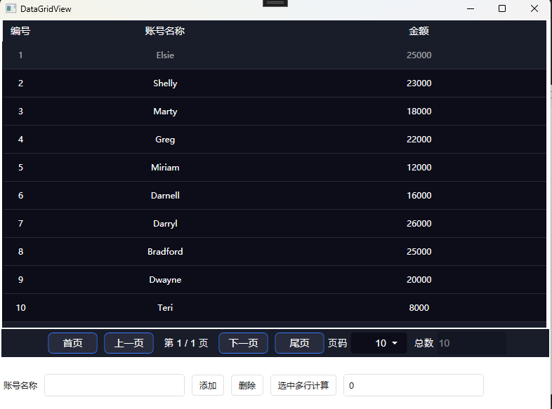
3.运行效果如下

源代码地址:https://gitee.com/chenshibao/wpfdemo.git
如果本文介绍对你有帮助,可以一键四连:点赞+评论+收藏+推荐,谢谢!
 京ICP备14020293号-4